Advanced Typography-Final Compilation and Reflection
Advance Typography GCD 61004
WEEK 01 - WEEK 07 (06.02.2024 - 19.03.2024)
NAME: Chai Wei Yi
I.D: 0369561
COURSE: Intercultural Design / Bachelor of Design (Honors) in Creative Media
GROUP: Class 01 Sec 01
Advance Typography -
Introduction
Submission
Task 1 : Exercise 1&2 -Typographic System and Type &
Play
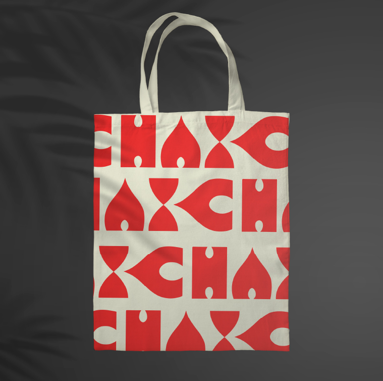
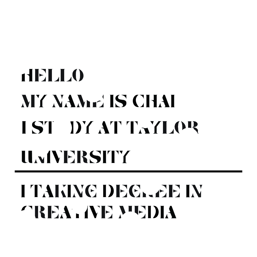
Final Outcome (Exercise 1) (JPEG)

|
| Figure 1.1 Typographic System Outcome |

|
| Figure 1.2 Typographic System Outcome |

|
| Figure 1.3 Typographic System Outcome |

|
| Figure 1.4 Typographic System Outcome |

|
| Figure 1.5 Typographic System Outcome |

|
| Figure 1.6 Typographic System Outcome |

|
| Figure 1.7 Typographic System Outcome |

|
| Figure 1.8 Typographic System Outcome |
Final Outcome (Exercise 1) (PDF) (With Grid)
Final Outcome (Exercise 1) (PDF) (Without Grid)
Final Outcome (Exercise 2) (JPEG)

|
Final Outcome (Exercise 2) (PDF)
Task 2: (A)Key Artwork and (B) Collateral
Black Wordmark on White Background

White Wordmark on Black Background

Colour Palette

Wordmark in actual colours on lightest shade of colour palette

Wordmark in lightest colours on darkest shade of colour palette

Wordmark Animation

Final Outcome (Task 2 B)
Collaterals-1

Collaterals-2

Collaterals-3
Task 2 :Submission with PDF Version
Task 3 :Type Exploration and Application (JPEG)

Final Outcome ( Font presentation)


Final Outcome ( Final Typeface Design)

Final Outcome ( Application)


Task 3 :Type Exploration and Application (PDF)
Final Reflection
Experience
Starting to design a typeface from scratch was tough but very rewarding.
The process began by looking deeply into what already exists, listening to
what users said, and finding needs that a new typeface could meet. This
groundwork was crucial for moving forward. I made many sketches and
digital versions, improving each one step by step. This work wasn't just
about creating another typeface; it was about making something that really
meets the specific needs of its users. Every piece of feedback from
friends and potential users helped me see the design in new ways and
deepened my understanding of this creative journey.
Observation
During this process, it was clear that focusing on the user's needs,
handling the technical parts of making the typeface digital, and being able
to adjust were key. Knowing who would use the typeface and how they would
use it was essential for making meaningful improvements. The skills needed
to keep the typeface looking good in different formats were crucial.
Finding
What I learned from this experience was a deep appreciation for the
principles of making text easy to read, consistent, and enjoyable to
interact with. A good typeface does more than just look nice—it makes the
text welcoming and clear, improving how people understand and feel about the
information. The ongoing process of testing, getting feedback, and making
changes wasn't just about fixing issues; it was about turning a vision into
a useful tool that helps people communicate better


Comments
Post a Comment