Advance Typography GCD 61004
WEEK 01 - WEEK 07 (06.02.2024 - 19.03.2024)
NAME: Chai Wei Yi
I.D: 0369561
COURSE: Intercultural Design / Bachelor of Design (Honors) in Creative Media
GROUP: Class 01 Sec 01
Advance Typography -
Introduction
Task 3 Type: Exploration & Application
3.1 Work Progress
3.1.1.Research
When I found out about this assignment, I happened to be traveling. I saw
this signboard, which gave me a new inspiration: Why must typefaces always
be complete? Perhaps incomplete ones, letting viewers guess what the
characters are, could bring them a sense of novelty and beauty
3.1.2.Ideation
With the idea mentioned above, I chose the font "extend" for this poster,
along with completing the unfinished letters. This was undoubtedly a
challenge, but it was an undeniable opportunity for me to become more
familiar with AI operations.
3.1.4.Explanation of the chosen idea
Expanding on this, embracing the challenge not only tested my design
skills but also pushed the boundaries of traditional typography. By
venturing into the realm of incomplete letters, I aimed to evoke curiosity
and engagement from the audience, encouraging them to interact with the
text in a way that traditional, complete fonts might not. This
experimental approach not only enhanced my technical skills but also
deepened my understanding of how design can influence perception and
interaction
3.1.5.References
I started browsing the internet, looking at many examples of incomplete
typefaces. After spending some time, I finally found a font that closely
matched what I had in mind. Inspired by this discovery, I began to sketch
out and refine my own concepts, using this font as a starting point. This
process involved experimenting with different ways to create characters that
were deliberately unfinished, yet still visually engaging and readable. My
goal was to push the limits of traditional typography and create something
uniquely expressive that would capture the imagination of viewers
3.2 Digitisation
4.Generating in font in FontLab 7
Once in FontLab, I began the meticulous process of fine-tuning each
character for consistency and clarity. This involved adjusting kerning,
line weight, and spacing to ensure that each element of the typeface
functioned harmoniously both individually and when used in text. The
digitalization step was critical as it allowed me to convert my
conceptual sketches into practical, usable font files. This stage was
not only about perfecting the visual aspects but also ensuring that the
typeface would be versatile and functional across different digital
platforms and print formats
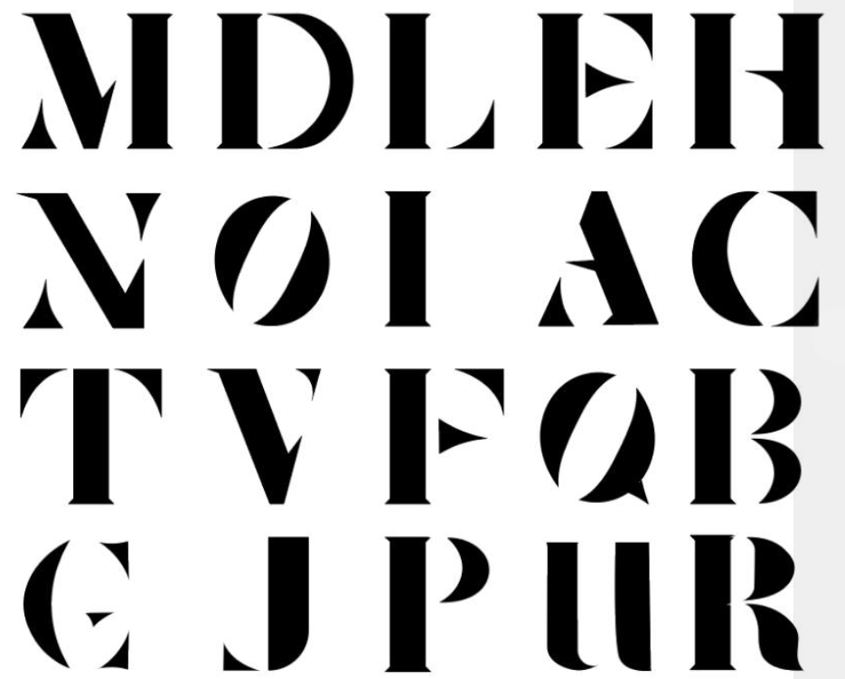
5.Font Presentation
5.1 SLIDE 1
This is the finished product I created. For the first page of the font
presentation, I chose it to serve as the introduction. This allows viewers
to directly appreciate the entire typeface I've designed. I decided that
showcasing the full alphabet set, numbers, and symbols right at the
beginning would immediately engage the audience and give them a
comprehensive view of my work. It sets the tone for the rest of the
presentation, highlighting the unique features and the creative approach I
took in designing each character. This upfront display not only
demonstrates the aesthetic appeal of the typeface but also its
functionality and versatility in various contexts, giving potential users
a clear idea of how it can be utilized in their own projects
5.2 SLIDE 2
5.3 SLIDE 3
The reason I am using this poster to present my font is that I created this poster with the idea of "Bike Font" (which is exactly the name of my font). It means there is something hidden beneath the surface of the font, so people need to use their imagination to fully appreciate it. I hope it can capture the viewer's attention
5.4 SLIDE 4
The inspiration for this idea came to me instantly when I was looking up the meaning of the word "imagination." It incorporates the explanation I found during translation. I believe that the "image" within the word "imagination" can prominently highlight the theme of this poster and convey the message I want to express
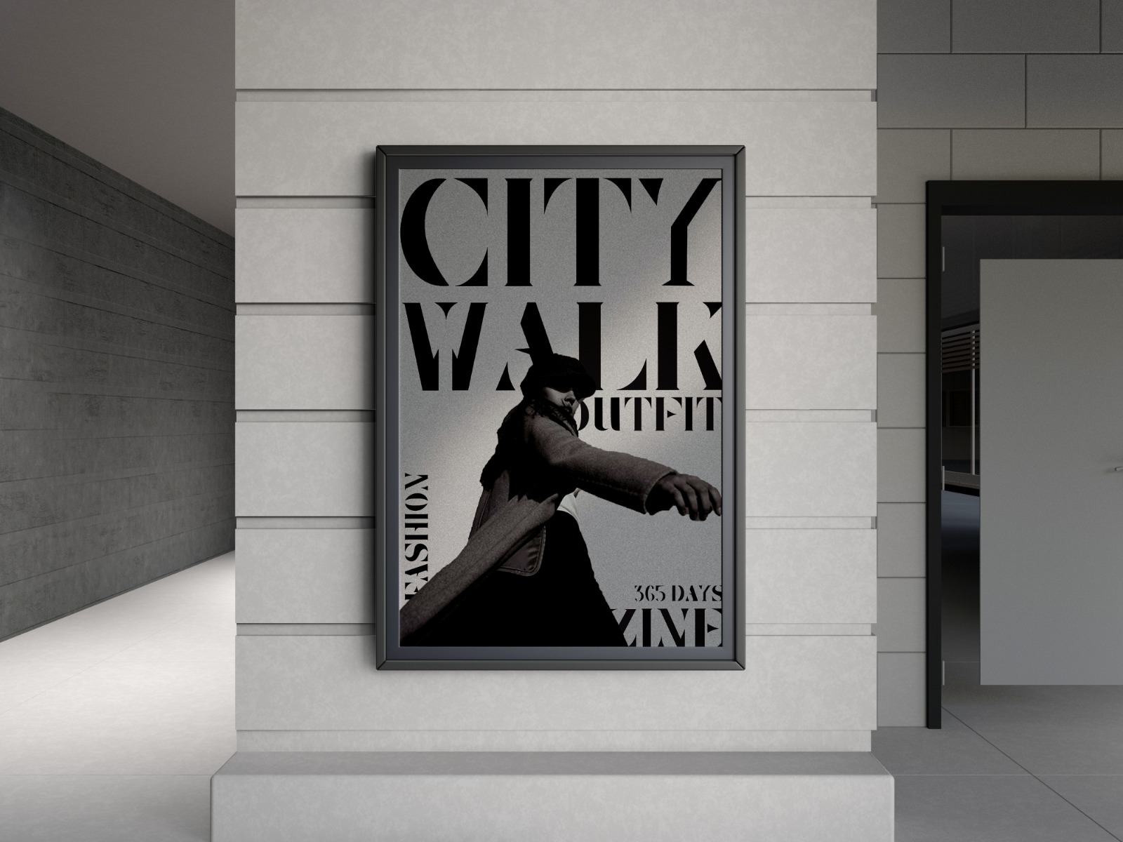
5.5 SLIDE 5
This poster is the closest to the final product among the five posters because it incorporates other elements, such as image elements and black circles, to attract attention. It also effectively expresses that sometimes works relying on imagination are indeed more eye-catching
6.Application Presentation
6.1 Application 1
6.3 Application 3
6.4 Application 4
7.Final Outcome
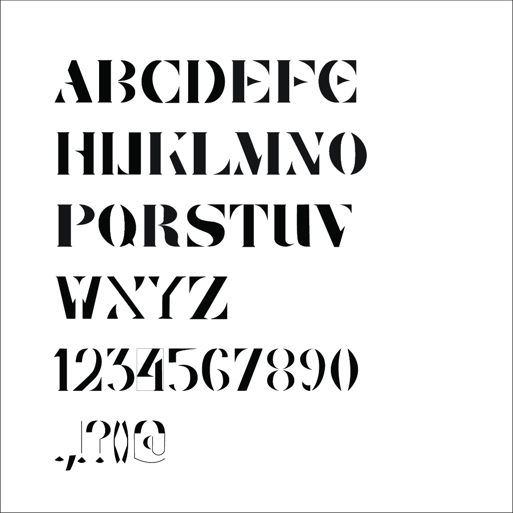
A-Z Numerals Punctuation ( JPEG)
A-Z Numerals Punctuation ( PDF)
Font Presentation 1-5 (JPEG)
Font Presentation 1-5 (PDF)
Application 1-5 (JPEG)
Application 1-5 (PDF)
Feedback
WEEK 8 (12/6/2024)
General Feedback:
ILW
Specific Feedback:
WEEK 9 (19/6/2024) General Feedback:
all letterforms are structured, this while creating your letterforms, make grids for each letter
Specific Feedback:
Make sure my process is together, and the words O and Q need to adjust
WEEK 10 (26/6/2024)
General Feedback:
Create baseline and grids for our font so that its accurate and consistent
Specific Feedback:
width of my letter not consistent
WEEK 11 (3/7/2024)
General Feedback:
While creating your typeface, be sure to use the 1000pt structure
Specific Feedback:
WEEK 12 (10/7/2024)
General Feedback:
When developing the font presentation, utilise a minimal number of colours to avoid making it appear too complicated. The font's unique personality is created by using basic and limited colour palettes. You can use another typeface to go along with your main font. Images can be used if needed.
WEEK 13 (17/7/2024)
General Feedback:
Make sure that we insert link to download our font. For final compilation, make sure that the quicks links is link to tasks (different tab/ blog) not on the same page..
Specific Feedback:
Reflection
Experience
Creating a typeface from scratch to tackle a specific problem was both tough and incredibly satisfying. I started by diving deep into research to really understand the common issues and needs in the field. This meant looking at lots of existing typefaces, reading what users had to say about them, and spotting where a new typeface could make a difference. I went through sketching, digitizing, testing, refining, and then applying the final design in various ways. I began with sketches to play around with different ideas, then used font design software to bring those sketches to life. I tested these designs for how easy they were to read and if there were any inconsistencies. Feedback from friends and potential users was crucial in making the design better. This whole journey taught me how vital it is to understand the field's specific needs and to keep refining the design.
Observation
While working on the typeface, I noticed a few important things. First, putting the user at the center of the design is key. Second, there are some technical hurdles in turning sketches into digital fonts. Third, the typeface needs to be flexible and work well in different situations. Understanding who will use the typeface and the context in which they'll use it helps pinpoint what needs improvement. Technical know-how is essential to ensure the design looks good at any size or resolution
Finding
Throughout the design process, I found that focusing on readability, consistency, and user experience is crucial. A well-crafted typeface not only makes text easier to read but also enhances understanding and leaves a good impression. Iteration is a big part of this – constantly testing, gathering feedback, and making refinements are necessary to address issues and improve the design


Comments
Post a Comment