Advance Typography GCD 61004
WEEK 01 - WEEK 07 (06.02.2024 - 19.03.2024)
NAME: Chai Wei Yi
I.D: 0369561
COURSE: Intercultural Design / Bachelor of Design (Honors) in Creative Media
GROUP: Class 01 Sec 01
Advance Typography -
Introduction
/>
Lecture Note
In today’s lecture, Mr. Vinod will explore Typographic Systems,
emphasizing the principle that all design rests on a structural system.
He will discuss eight major variations of typographic systems:
Axial System: Elements are organized along a single
axis, which can be straight or bent, establishing a clear directional
flow.


Figure 1.0 (Left) & 1.1 (Right) Examples of Axial System
Radial System: Design elements radiate from a central focal point, creating a
dynamic visual impact.


Figure
1.2 (
Left) & 1.3 (
Right) Examples of Radial System
Dilatation System: Elements expand outward from a
central point in a circular pattern, with more crucial information placed
inside and less important details on the outer rings.


Figure
1.4 (
Left) &
1.5 (
Right)
Examples of Dilatation System
Random System: At first glance, elements seem to lack a pattern, but there's
underlying order in the apparent chaos.

Figure 1.6 (
Left) & 1.7 (
Right) Example of Random System
Grid System: A network of intersecting vertical
and horizontal lines guides the arrangement of content, promoting a
structured and balanced layout.
Transitional System: This system features
informal, layered banding that transitions across the space, providing a
fluid visual narrative.
Modular System: Consists of standardized,
non-objective units that are identical in size and can be repositioned
within different spaces for flexible design options.
Bilateral System: Elements are symmetrically
arranged around one or more axes, offering a mirrored, balanced
aesthetic.
Figure 1.11
(
Left) & 1.12 (
Right) Example of Bilateral System
Mr. Vinod will stress the importance of aligning the design's form with
its content to ensure clarity and effective communication. This includes
considerations such as hierarchy, order of reading, legibility, and
contrast. He will also introduce the concept of Shape Grammar—an
architectural term that refers to a set of rules applied step-by-step to
generate a language of designs. Each typographic system provides a
unique set of rules that guide and focus decision-making in design.
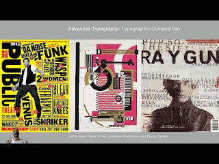
Lecture 02: AdTypo_2_Typographic Composition
In the lecture video titled "AdTypo_2: Typographic Composition," Mr.
Vinod delves into the art of arranging textual information within a
given space, utilizing various design principles to enhance visual
appeal, engagement, and readability.
Typographic composition refers to the strategic
arrangement of textual content in a space. The design composition
principles involved include:
-
Emphasis: Highlighting key information with
different fonts or colors.
-
Isolation: Setting apart elements to draw focus.
-
Repetition: Using consistent stylistic features
to create visual harmony.
-
Symmetry and Asymmetry: Balancing elements to
form a pleasing or engaging layout.
-
Alignment: Aligning text to improve the structure
and readability.
-
Perspective: Adding depth to the composition,
though more subtly than in visual arts.
Applying these principles to text and images can sometimes be
challenging, especially in translating concepts like repetition and
perspective into textual formats.
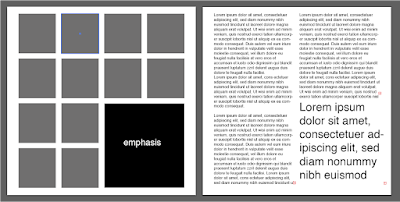
Figure 1.14 Emphasis in Typographic Composition
The Rule of Thirds and Typographic Systems
Figure 1.15 Rule of Thirds
The Rule of Thirds, a key guideline from
photography, suggests dividing the frame into nine equal parts for
placing points of interest. While not commonly used in typography,
its principles can subtly influence typographic layouts.
Mr. Vinod also discusses typographic systems,
particularly highlighting the Grid System.
Developed further by the Swiss Modernist style, pioneers such as
Josef Muller Brockmann, Jan Tschichold, and Max Bill have
popularized this method due to its orderly, versatile nature. The
grid system allows for numerous adaptations, favoring organized
compositions over chaotic ones.
Challenging the Conventional: Modernist Era and Beyond
During the modernist era, some young designers challenged these
traditional methods, opting instead for designs that embraced chaos,
randomness, and asymmetry. Mr. Vinod will showcase examples from
advocates of this disruptive approach.
Additional Models and Systems
Figure 1.17 Environmental Grid
Figure
1.18 Form and Movement
Lecture 03: AdTypo_3_Context&Creativity
This lecture explores the evolution of ancient scripts into
modern languages, highlighting the significance of
understanding the context of handwritten scripts to gain
insights into a civilization.
Handwriting
The study of handwriting is essential because early
mechanically created letterforms were designed to closely
mimic handwritten forms. Handwriting laid the foundation for
the form, spacing, and conventions that mechanical
typewriters sought to replicate.
Figure 1.20 Movable Type
Development of Western Handwriting
The progression of Western handwriting began with Cuneiform,
which evolved into Hieroglyphics. These then transitioned
into Early Greek, using Phoenician letters, and further
developed into Roman Uncials and English Half Uncials.
Emperor Charlemagne standardized handwriting with
Carolingian Minuscule, which eventually evolved into
Blackletter. The Italian Renaissance played a crucial role
in the transition to Movable Type.
Movable type was introduced between 1000 and 1100 CE, with
early examples found in China and achieved in Korea with the
Diamond Sutra. The Koreans established a foundry to cast
movable type in bronze several decades before Gutenberg’s
bible was printed in Europe in 1439.
Development of Eastern Handwriting
The advent of digital technology spurred the Western world
to digitize and commercialize historical works through type
foundries. While there is growing appreciation for
historical letterforms, Western colonization of the East has
adversely affected its heritage, cultural traditions,
literature, arts, languages, and scripts, often leading to
their suppression or stagnation.
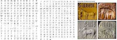
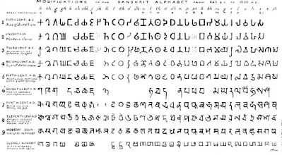
Southern Asia
Figure
1.21 Indus Valley Civillization script
The Indus Valley Civilization (IVC) script, dating back to
3500-2000 BCE, is the oldest writing system found in the
Indian subcontinent. The Brahmi script, developed around
450–350 BCE, is the earliest writing system in India after
the Indus script and has significantly influenced all modern
Indian scripts and several scripts in Southeast and East
Asia.
Southeast Asia
Figure 1.22 Brahmi script
The oldest writing systems in Southeast Asia originated from
Indian scripts, with the Pallava script, used for writing
Sanskrit and Tamil, being the most important. The Pra-nagari
script was used in India to record Sanskrit texts. Kawi, the
significant historical script of Indonesia, derived from
Nagari, was native to Java and used for communication with
other kingdoms, forming the basis for other scripts in
Indonesia and the Philippines.
Figure 1.23 Incung
Incung, the original script from Kerinci, comes from the
Rencong scripts of South Sumatra. Indonesian scripts such as
Rajang, Batak, Bugis (Lontara), and Javanese were
assimilated into Peninsula Malay communities. Jawi, an
alphabet based on Arabic, was introduced with Islam, taught
by traders to the illiterate, and gradually adopted by the
upper and middle classes in trading ports. In modern
Malaysia, Jawi holds significant cultural importance as it
is the script for renowned literary works, unlike Indonesia,
which lacks a substantial number of pre-Jawi inscriptions.
Programmers and Type Design
Companies like Google are employing Asian programmers and
designers to create more vernacular and multi-script
typefaces, facilitating communication in both vernacular and
Latin scripts.
Figure 1.24 Baloo
Local Movements and Individuals
Murasu.com, led by programmer and typographer Muthu
Nedumaran, developed the programming language needed to
encode various vernacular writing systems, now used in
mobile phones and desktops. Huruf, a group of graphic
designers in Malaysia, works to preserve and modernize local
Latin and vernacular letterforms found on walls and signage,
digitizing and revitalizing these unique letterforms. In
India, Ek Type and Indian Type Foundry have significantly
contributed to the development of vernacular typefaces
Lecture 04: AdTypo_4_Design Type
Figure 1.25
Lecture video AdTypo_4_Design Type
In this lecture, Mr. Vinod explained the process of designing type,
detailing the approaches of notable type designers such as Adrian
Frutiger, Matthew Carter, and Edward Johnston.
Type Design Process
-
Research
-
Understand the history of typography, including the anatomy of
type, conventions, and terminologies.
-
Determine the purpose of the typeface and its various
applications.
-
Study existing fonts for inspiration, reference, and
understanding of usage patterns.
-
Sketching
-
Begin with traditional or digital sketches to conceptualize
the typeface.
-
Digitization
-
Use professional software such as FontLab and Glyphs App for
digitizing the typeface.
-
While some designers use Adobe Illustrator and other
specialized font apps, this approach is often frowned upon by
purists.
-
Testing
-
Conduct rigorous testing to refine and correct various aspects
of the typeface.
-
Prototyping provides crucial feedback on readability and
legibility.
-
Consider the typeface category, as display types prioritize
form expression.
-
Deployment
-
Even after deploying a completed typeface, unforeseen issues
may arise, necessitating ongoing revisions.
-
Rigorous testing is essential to ensure that any remaining
issues are minor.
Typeface Construction
Figure 1.26 Construction grid for
roman capitals (8 x 8 cells) - Week 04 (13/05/2024)
Grids and Circular Forms
-
Utilize grids and circular forms to help construct letterforms.
This method can aid in developing and designing consistent
letterforms.
Construction and Considerations
Figure 1.27 Classification according
to form and construction - Week 04 (13/05/2024)
-
When designing a new typeface, consider various forms and
constructions.
-
Apply visual corrections such as extruding curved forms past the
baseline and cap line (overshoot) and ensuring vertical alignment
between curved and straight forms.
-
Fitting the Type: Visual correction is crucial
for letter spacing. Adjust the letters to maintain consistent
white space between them for optimal readability and aesthetics.
By following these steps and considerations, type designers can
create well-crafted typefaces that meet both functional and
aesthetic requirements.
Lecture 05: AdTypo_5_Perception and Organization
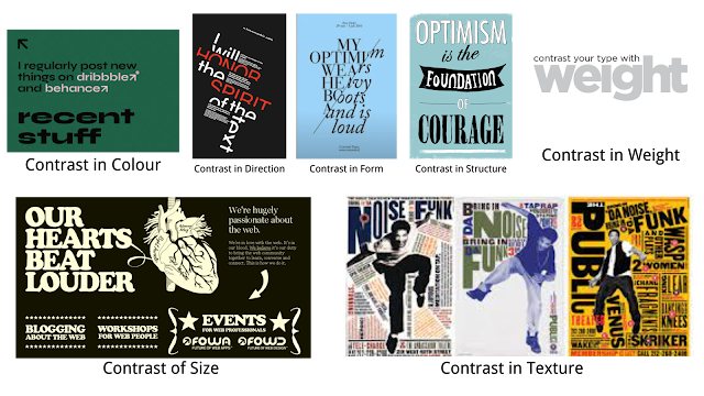
Perception
Perception in typography involves the visual presentation and
understanding of text through the use of contrast, shape, and
structure. Creating distinction and differentiation between
information using contrast is crucial. According to Carl Dair,
contrast can be achieved through texture and direction in type.
Figure 1.29
Contrast in Typography
There are seven ways to create contrast in typography:
- Contrast of size
- Contrast of weight
- Contrast of form
- Contrast of structure
- Contrast of texture
- Contrast of color
- Contrast of direction
Figure 1.30 Examples of Carl Dair's method
to create contrast
Form refers to the overall look and feel of the
elements in a typographic composition. Good form in typography is
visually appealing and enhances readability.
Figure 1.31
Form in Typography
Organization and Gestalt
Gestalt is a German term referring to the arrangement
or composition of elements. Gestalt theory posits that perceiving
things as a cohesive whole is more significant than perceiving them as
individual parts, which is applicable to designing layouts.
Some principles of Gestalt psychology include:
Figure 1.32
Law of Proximity
-
Proximity: Elements close to each other are
perceived as a group.
Figure 1.33 Law of Similarity
-
Similarity: Elements with similar characteristics
are perceived as part of the same group.
-
Continuity: Humans perceive intersecting objects as
distinct and uninterrupted.
-
Closure: The mind perceives whole images even when
they are partially incomplete.
-
Area and Symmetry: Elements that form a symmetrical
or continuous shape are perceived as a group.
Class Summary
Week 00:
-
Watch Lecture Video 01, Tutorial Video on InDesign Formatting, and
an additional explanation video on the Modular system.
- Read instructions for Task 01, Exercise 01 in the MIB.
-
Read "Typographic Systems" by Kimberly Elam for further
understanding.
- Set up an e-portfolio for the Advanced Typography module.
-
Update the e-portfolio with lectures, process work (research and
process), and final outcomes for Task 01, Exercise 01. Ensure final
submissions are clearly labeled.
-
Export final outcomes as JPEG @300ppi and PDF with and without
guides. Compile all 8 systems together.
Week 01:
-
Watch Lecture 1 and video tutorials on InDesign Formatting and the
Modular System.
-
Optionally, read further on the topic in "Typographic Systems" by
Kimberly Elam.
-
Refer to sample student e-portfolios for analysis and evaluation.
-
Update your e-portfolio with lectures, process work (research and
process), and final outcomes, ensuring segregation of final
outcomes. Update reflections and further reading sections.
-
Export final outcomes as JPEG @300ppi (1024 px) and PDF with and
without guides. Compile all 8 systems together for PDF presentation.
Week 02:
-
Watch the second lecture and document a summary in your e-portfolio.
-
View previous student e-portfolios to understand documentation for
Exercise 2: Finding Type (Type & Play).
-
Document the process work for Exercise 2 in your e-portfolio. Final
submission should include:
- Image
- Extracted letterforms on baseline (Illustrator)
- Reference font
- Final letterforms on baseline
- Original extraction and final letterforms side by side
Week 03:
-
Watch and document a summary of the third lecture in your
e-portfolio.
-
Complete Exercises 1 and 2, refining as necessary before week 4's
class.
-
Update and complete Task 1 Exercises with lectures, process work,
feedback, reflections, and further reading before week 4.
-
Update the Google Feedback Sheet with Week 3's feedback
(general/specific).
2.1 : Exercises 01 - Typographic Systems
We were tasked to create a layout for each typographic system with
the given content. The EIGHT typographic systems are as follows: Axial,
Radial, Dilatational, Random, Grid, Modular and Transitional.
Axial
-
Axial System involves aligning all elements to one side of a single
axis, either left or right.

|
|
Figure2.0 Example of Axial System
|

|
|
Figure2.1 Example of Axial System
|

|
|
Figure2.2 Example of Axial System
|
Radial
-
In the Radial system, all elements radiate outward from a central
point of focus, which may include multiple focal points.

|
|
Figure2.3 Example of Radial System
|

|
|
Figure2.4 Example of Radial System
|

|
|
Figure2.5 Example of Radial System
|
Dilatational
-
In the Dilatation System, all elements expand from a central point
of focus in a circular fashion

|
|
Figure2.6 Example of Dilational System
|

|
|
Figure2.7 Example of Dilational System
|
Random
-
In the Random System, elements are arranged without any specific
pattern or discernible relationship.

|
|
Figure2.8 Example of Random System
|

|
|
Figure2.9 Example of Random System
|
Grid
-
In the Grid System, elements are arranged within a framework of
horizontal and vertical divisions.

|
|
Figure2.10 Example of Grid System
|

|
|
Figure2.11 Example of Grid System
|
Modular
-
The Modular System consists of non-objective elements constructed
from standardized units.

|
|
Figure2.12 Example of Modular System
|

|
|
Figure2.13 Example of Modular System
|
Transitional
-
The Transitional System involves an informal approach to layered
branding

|
|
Figure2.14 Example of Transitional System
|

|
|
Figure2.15 Example of Transitional System
|
Bilateral
-
In the Bilateral System, all texts are arranged symmetrically along
a single axis

|
|
Figure2.16 Example of Bilateral System
|

|
|
Figure2.17 Example of Bilateral System
|
Final Outcome of 8 Typo system (without Grid)
Final Outcome of 8 Typo system (with Grid)
Final Outcome of 8 Typo system (JPEG)
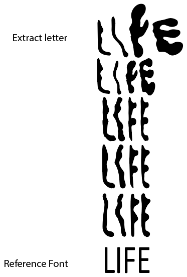
Task 01: Exercises 02 - Type and Play
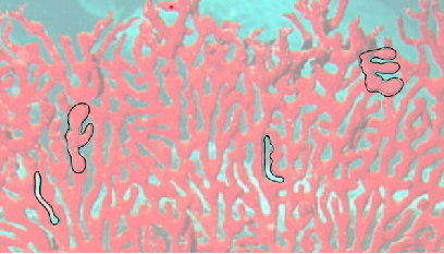
During Week 2, we are tasked to select an image of a man-made object
(chair, glass, etc.) or structure (buildings), or something from nature
(Human, landscape, leaf, plant, bush, clouds, hill, river, etc). Avoid
selecting an image that contains too many different elements. Extract at
least 5 letterforms from the image and form a word if it is
possible.

|
|
Figure 3.0 Reference Picture - Week 02 (29/04/2024)
|
|
|
Traced outline - Week 02 (29/04/2024)
|
|
Figure 3.2 First Attempt: Refinement of
Letterforms - Week 02 (29/04/2024)
|
|
Poster
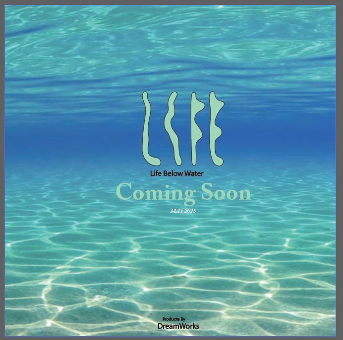
For the second part of the assignment, we are to combine the final extracted
letterforms with a relevant image to create a 1024px x 1024px poster.
Image Searching


Figure 3.3&3.4 Choosen Images
for creating the poster - Week 03 (06/05/2024)
Progress
I spent a long time on Pinterest searching for the perfect wallpaper to
use as my background, and I finally found the perfect one. This search was
important to me because I wanted a background that not only matched my
aesthetic but also inspired creativity and added a personal touch to my
space. The right wallpaper can transform a room, and finding one that fit
my vision was truly satisfying. It feels great to see how it complements
the other elements in the room and enhances the overall atmosphere

|
|
Figure 3.5 Suitable Background
|

|
|
Figure 3.6 After apply letterform
|
|
|
Figure 3.7 Adjust all the details
|

|
|
Figure 3.8 Final Outcome
|
Final Submission of Task 01: Exercises 02 - Type and Play
Reflection
Experience
Exercise 01 was challenging for me, especially when trying to find creative
layouts while strictly adhering to the systems. I was concerned that my work
would look too similar to what my classmates submitted, making it difficult
to highlight my unique style while still appealing to the teacher. I felt
pressured to create unique layouts. However, I later decided that there's
nothing wrong with imitation. By mimicking excellent work, we can learn and
improve. In this process, we can also learn how they created these things
and occasionally find inspiration. Therefore, before starting my
assignments, I would refer back to my seniors' e-portfolios
Observation
During Exercise 1, I learned the importance of spacing and color choices in
final compositions. Proper spacing between elements and pleasant color
combinations were key to creating attractive layouts. In Exercise 2, I
noticed the risks of relying too much on the reference typeface. I tried to
find a balance and improve the design without depending too much on any
single feature. This showed how crucial composition and color selection are
in making posters. I observed that posters should not be too cluttered, and
the overall color scheme, especially for company logos, should be clear and
consistent.
Finding
In Exercise 1, I learned how to blend composition and creativity to craft
engaging and expressive layouts. This exercise taught me the importance of
exploring every idea, no matter how preliminary it might seem, because even
basic concepts can lead to impressive results. However, in Exercise 2, I
faced challenges in creatively incorporating my work with a typeface. It was
only after thoroughly examining the references of the original elements that
I realized how much such research could expand my artistic horizons.
Further Reading
"Typographic Systems" by Kimberly Elam will provide you with a solid
foundation in understanding the structured application of typography. This
will be especially useful as you delve deeper into typographic design
during Week 00 to Week 01 of your studies. The book’s focus on different
systems will give you practical insights that you can apply to your design
projects.
"Typographic Systems" by Kimberly Elam offers an in-depth exploration of
typographic design, delving into how typography can be effectively
structured to communicate clearly and attractively. The book explains
critical design elements such as grids, hierarchy, contrast, scale, and
rhythm, providing visual examples that demonstrate these concepts in
action. Elam uses real-world examples and detailed case studies to show
how these typographic systems can be tailored to fit both print and
digital formats, making it an essential resource for designers aiming to
refine their skills and produce visually engaging designs.
Week 00
Chapter 01: Introduction This chapter explains
that all design uses structures, grouped into eight main types.
These structures help designers organize content effectively.
Typographic design is complex because it needs clear
communication and considers things like hierarchy and
readability. These systems guide designers and encourage
creativity. Although many designers use the grid system, the
book shows other systems too with visual examples.
Week 01
Chapter 02: Project Elements and Process This
chapter describes eight typographic systems and their features:
-
Axial: Elements organized along a single
axis.
-
Radial: Elements extend from a center point.
-
Dilatation: Elements expand from a central
point outward.
-
Random: Elements are placed without a clear
pattern.
-
Grid: Elements are arranged in a grid of
vertical and horizontal lines.
-
Transitional: A layered, informal system.
-
Modular: Elements are standardized units.
-
Bilateral: Text is symmetrically arranged
along an axis.
Week 02
Mr. Vinod recommends reading his article "Finding Type: A Novel
Typographic Exercise" for Exercise 02. The article explains how
to:
- Find an image with distinct characteristics.
-
Deconstruct the image to identify and extract letterforms.
-
Choose a reference and refine the letterforms, ensuring
consistency and simplicity.
Week 03
Chapter 03: Constraints and Options The chapter
discusses how text settings like line breaks, leading, and
spacing can change a text's appearance and readability:
-
Line Breaks: Dividing text into lines helps
group related text, improving readability.
-
Leading: Varying the space between lines
changes the text's look from tight to airy.
-
Word and Letter Spacing: Adjusting these can
change the text's texture and tone, making it clearer or more
blended
Feedback
Task 01: Exercise 01 - Typographic Systems
Week 01
General Feedback:
Briefing for MIB and assigned task 1
Week 02
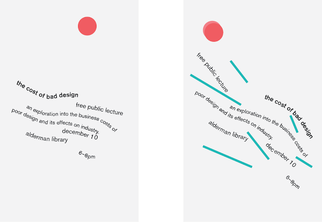
General Feedback:
Make sure that to avoid aggressive line angles for
information. Limit strong graphical elements. Maintain
readability even in randomness. Avoid serifs as outlines due
to varying stroke thickness. Numbers don’t need to be larger
than words. Outlines around text can hinder readability. Red
on black is not effective.
Week 03
General Feedback:
Consider if the typeface you have chosen is appropriate for
the image. Especially when designing width and weight,
consistency is key. When extracting a picture, carefully
select the areas of the image to use in large parts (if
applicable).
Week 04
General Feedback:
Make sure the title and the image are the focal points of
the poster, and that everything is readable and not overly
crowded.


Comments
Post a Comment