Typography - Task 1: Exercise 1 & 2
3.11.2023 - 10.11.2023 / Week (6)- Week (7)
Chai Wei Yi (0369561)
Typography / Bachelor of Design (Honours) in Creative Media / Taylor's
University
LECTURES
Week 6:Summary of my lecture here
Letters/ Understanding letterforms
Despite the apparent symmetry suggested by the uppercase letter forms, they do not exhibit true symmetry upon closer inspection. The Baskerville stroke form reveals distinct stroke weights, with each bracket connecting the serif to the stem featuring a unique arc. While the capital letters may imply balance, the clear variation in stroke weights and the individuality of each bracket's arc challenge the notion of perfect symmetry
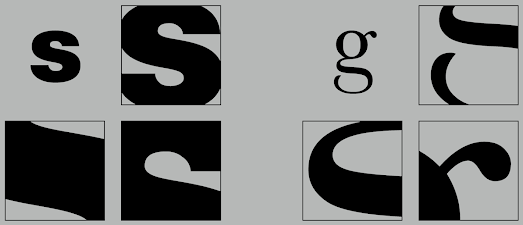
Letters
Upon meticulous examination, it becomes evident that the left slope's breadth is notably slimmer than that of the right stroke in uppercase letter forms. This discrepancy in stroke width underscores the careful consideration required by type designers to craft letterforms that achieve both internal harmony and individual expressiveness, as exemplified by the designs of Baskerville and Univers. Both typefaces, showcased above and below, illustrate the meticulous attention a designer invests to ensure a balance between internal coherence and unique expression in their letterforms
Examining the lowercase 'a' in seemingly similar sans-serif typefaces, Helvetica and Univers, neatly illustrates the intricacy of each individual letterform. A notable difference in character becomes apparent when comparing how the stems conclude and how the bowls intersect with the stems. This serves as an effective method to highlight the nuanced variations in the design of these two typefaces
Letters/ Maintaining X-height
The x-height serves as a descriptor for the size of lowercase letterforms. It's crucial to note that curved strokes, such as those in the letter 's,' need to extend beyond the median or dip below the baseline to give the impression of being the same size as the adjoining vertical and horizontal strokes. In this context, the median line, situated above the baseline, and the baseline, positioned below the median line, play pivotal roles. Generally, letters like 'O' and 'Z' might appear smaller due to their reduced estate or area touching both the median and baseline.
Form/Counterform
Counterform refers to the space defined and often enclosed by the strokes of a letter's form. Letters with closed counters, such as A, B, D, O, P, Q, R, a, b, d, e, g, o, p, and q, contribute to this space. When these letters combine to form words, the spaces between them collectively constitute the counterform. The effective management of counters directly influences the cohesiveness of text flow and our comprehension of the written content. This becomes particularly crucial when dealing with letterforms like the lowercase 'r,' which lacks distinct counters. Proficient handling of counters allows us to gauge how well words come together and enhances our ability to understand the overall message.
Srutinizing a letter's form and counter is an insightful method for gaining a deep understanding of these elements. Such examinations provide a clear understanding of the unique qualities of letterforms and offer valuable insights into how the harmony between form and counter is achieved. Additionally, this process provides a glimpse into the intricate art of letter writing.
Contrast
Typography is directly related to Graphic Design fundamentals. Many variations are produced by the basic contrasts: small + organic/large + machined; small + dark/large light, etc.
Week 7:Summary of my lecture here
1)Print Type / Screen Type
Typography was originally developed with a focus on print reading, predating the era of screen-based reading. The designer's duty is to ensure that the language is easily readable, flows smoothly, and is conducive to comprehension.
For optimal printing, excellent typefaces such as Caslon, Garamond, and Baskerville are widely favored. These fonts are renowned for their sophistication and elegance while maintaining readability even in small print. The classic nature of these typefaces, coupled with their neutrality and versatility, makes them effortlessly readable and adaptable, simplifying the typesetting process.
Type For Screen
Web-optimized typefaces undergo various modifications to enhance their readability and performance across diverse digital platforms. These adjustments include a taller x-height or reduced ascenders and descenders, wider letterforms, more open counters, heavier thin strokes and serifs, reduced stroke contrast, and modified curves and angles in specific designs. In the past, screens lacked clarity, leading to the development of typefaces tailored for these limitations, such as Verdana and Georgia, as opposed to delicate typefaces like Bodoni. The evolution of web-safe typefaces prioritizes improved character recognition and overall legibility in non-print environments like the web, e-books, e-readers, and mobile devices. The incorporation of open spacing is particularly crucial for smaller font sizes. These adaptations collectively contribute to the effective communication of text in the digital realm
Hyperactive Link / Hyperlink
A hyperlink is a clickable element, typically a word, phrase, or image, that enables users to navigate to a different document or section within the current one. Nearly ubiquitous on web pages, hyperlinks serve as a fundamental means of moving from page to page. Text hyperlinks are conventionally displayed in blue and underlined. Regardless of whether it's applied to text or an image, the cursor transforms into a small hand pointing at the link upon hovering over it. This navigation feature has been a longstanding and enduring method for online document exploration across various platforms
Font Size For Screen
To accommodate reading distance, 16-pixel text on a screen aligns closely with the size of text typically printed in books or magazines. Books, set at approximately 10 points, cater to close reading, often just a few inches away. For arm's length reading, a minimum of 12 points is recommended, mirroring the size equivalence of 16 pixels on most screens. Ideal point sizes for screen reading fall within the range of 20 to 24
System Fonts For Screen / Web Safe Fonts
Every device is equipped with a default set of fonts, primarily determined by its operating system. However, the challenge lies in the slight variations between them. Devices running on Windows may have one set of pre-installed fonts, while MacOS devices have another. Google's Android system, on the other hand, employs its own unique selection. Common examples of these pre-installed fonts include Open Sans, Lato, Arial, Helvetica, Times New Roman, Times, Courier New, Courier, Verdana, Georgia, Palatino, and Garamond
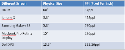
Pixel Differential Between Devices
The screens of our personal computers, tablets, phones, and televisions not only come in various sizes but also exhibit differences in text proportion due to variations in pixel sizes
2)Static / Motion
Motion
In temporal media, typographers seize the opportunity to "dramatize" type, infusing letterforms with a sense of fluidity and kinetic energy (Woolman and Bellantoni, 1999). Film title credits, a prime example, dynamically present typographic information over time, often brought to life through animation. The realm of motion graphics, especially in the brand identities of film and television production companies, increasingly incorporates animated type. Music videos and advertisements frequently overlay type, setting it in motion to synchronize with the rhythm of the soundtrack. The evolution of on-screen typography has rendered it highly expressive, playing a crucial role in establishing the tone of associated content and conveying a set of brand values. Particularly in title sequences, typography becomes a means to prepare the audience for a film by evoking a specific mood
Static
Static typography, with its limited characteristics in conveying words, pales in expressive potential compared to dynamic features. From billboards and posters to magazines and flyers, static typography takes diverse forms, serving informational, promotional, formal, or aspirational purposes. The impact and impression it leaves on the audience are intricately tied to the emotional connection it establishes with viewers. Unlike dynamic properties that offer a richer range of expressive possibilities, traditional attributes like bold and italics only scratch the surface in conveying the intended message
eXERCISE
tASK 2 :editorial LAYOUT
Research
Formatting text to enhance readability, legibility, and visual appeal is referred to as text formatting typography. For this specific undertaking, I've chosen to delve into research to draw inspiration. Conducting this research will also contribute to a deeper comprehension of employing diverse fonts, fine-tuning spaces and sizes, aligning text, and managing spacing
When I finish my research online, I start sketching out all my ideas with Adobe Illustrator. In the process, I face a few problems. Then, I try to find more ideas online, and finally, I complete the sketching and begin text formatting.
After completing my sketches, I proceeded to illustrate them using Adobe Illustrator, incorporating the 10 fonts recommended by our lecturer. The images below showcase my headline sketches.
FINAL TEXT FORMATTING WITH GRID
FINAL TEXT FORMATTING WITHOUT GRID
FINAL TEXT FORMATTING WITH GRID(PDF)
FINAL TEXT FORMATTING WITHOUT GRID(PDF)
HEAD
Font/s: Adobe Caslon Pro Bold
Type Size/s: 18pt
Leading:60pt
Paragraph spacing: -
BODY
Font/s: Adobe Caslon Pro Regular
Type Size/s: 12pt
Leading: 06pt
Paragraph spacing: none
Characters per-line: 59
Alignment: Align Left
Margins: 10mm Top, 10mm Left , 10mm Right , 10mm Bottom
Columns: 2
Gutter: 5 mm
Feedback
WEEK 6
General feedback:
No feedback given
Special feedback:
No feedback given
week7
general feedback:
Take attention in the number of character
special feedback:
Wrong font use, should use the font that provided
Further reading
rEFLECTION
In my module, Typography Task 2, I learned a lot of basic skills about Adobe Illustrator. Furthermore, I also advanced my basic skills that I had learned in weeks 1-6, which were applied in Task 1. The new skills that I learned from Task 2 include the use of grids, customizing layouts, and, specifically, text formatting. I trust that the skills I learned from Tasks 1 and 2 can really make my work easier and more effective in completing it.
EXperience
In this task, I faced a lot of problems, such as consistently forgetting to adjust the spacing between letters properly. I struggled with this task due to my lack of understanding of layout creation. I felt overwhelmed and frustrated because of the overload of information regarding layout design
Finding
In Task 2, I realized that research is a step that is really important for success or creating a good design. We have to do a lot of research and reference, which can help us get more ideas during brainstorming. "Practice makes perfect." Besides doing a lot of preparation for the project, I believe that practice and hard work are also key to success. Therefore, I need to invest more time and attention into every single part of my project, even if it doesn't look really good at the start.


.jpeg)
.jpeg)


Comments
Post a Comment